FF Formo
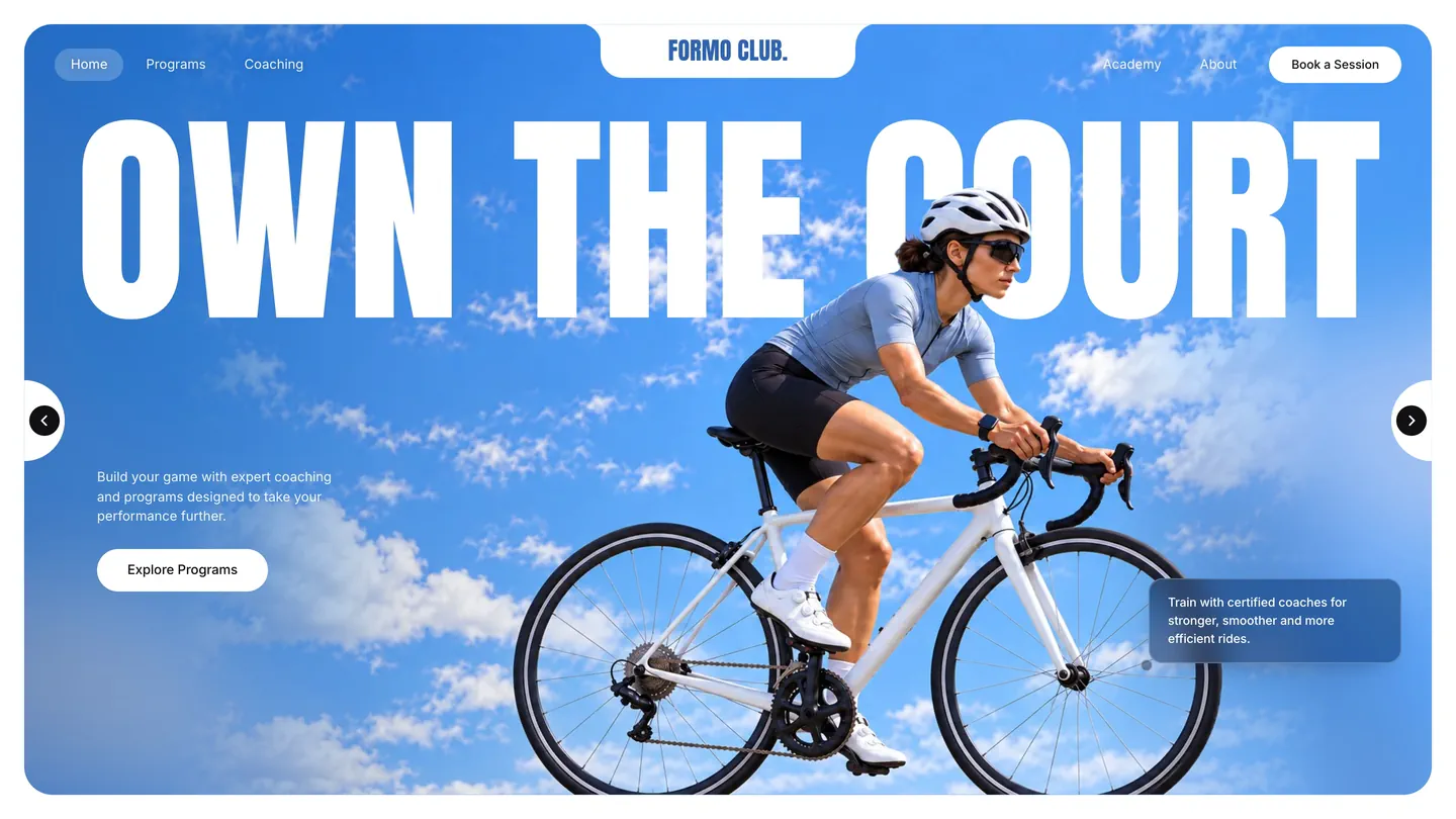
Demo recreationA landing-page concept by @bee_ui.ux, rebuilt one to one by FF Dev Studio from five screenshots. The design is theirs; Formo Club is a fictional club and every photo was generated for the demo. Not affiliated.
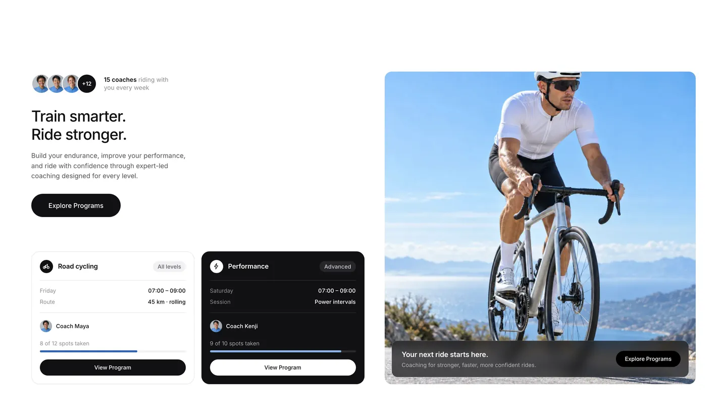
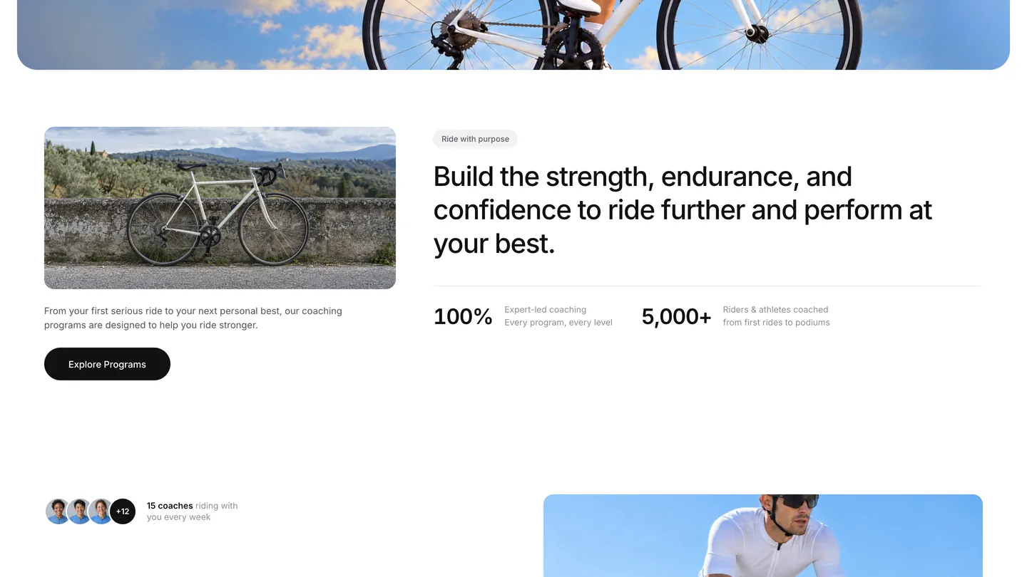
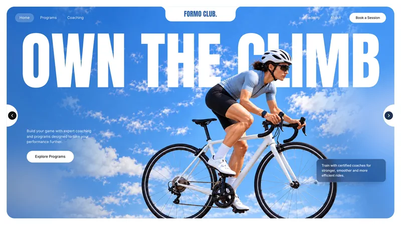
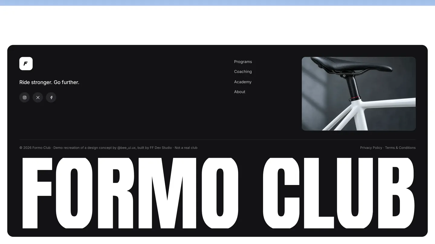
A cycling-club landing page that existed only as five phone screenshots, built into a working site.
About
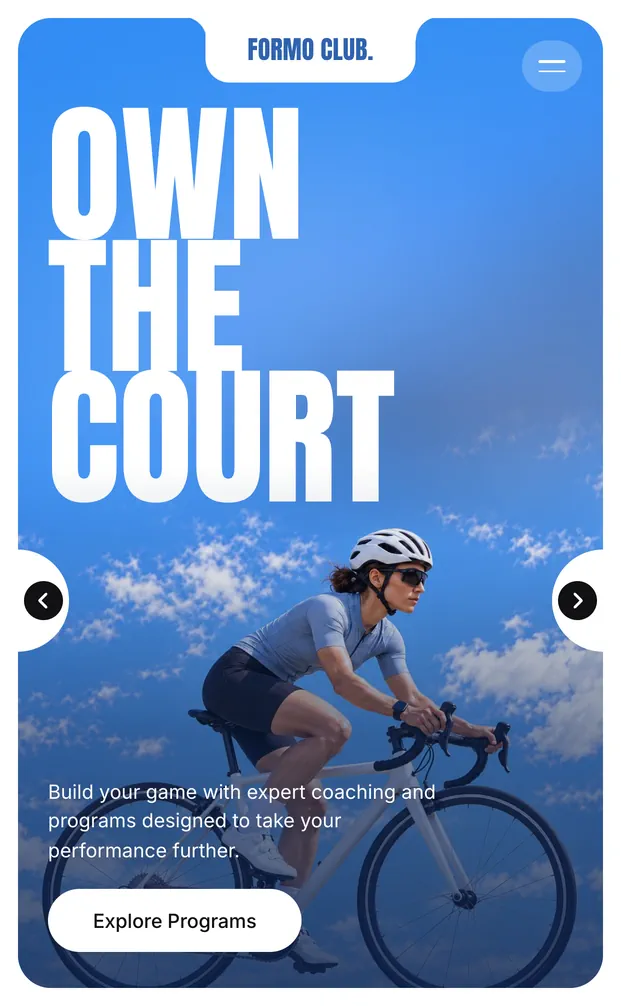
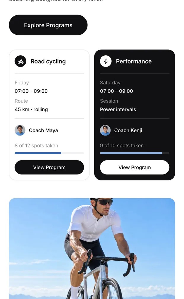
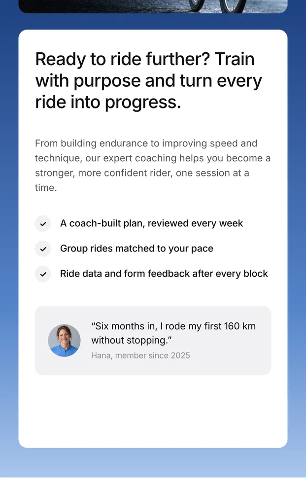
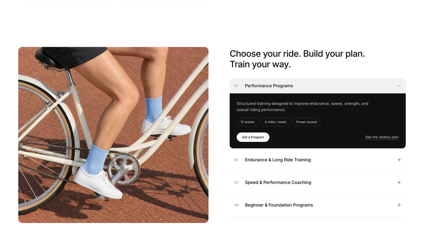
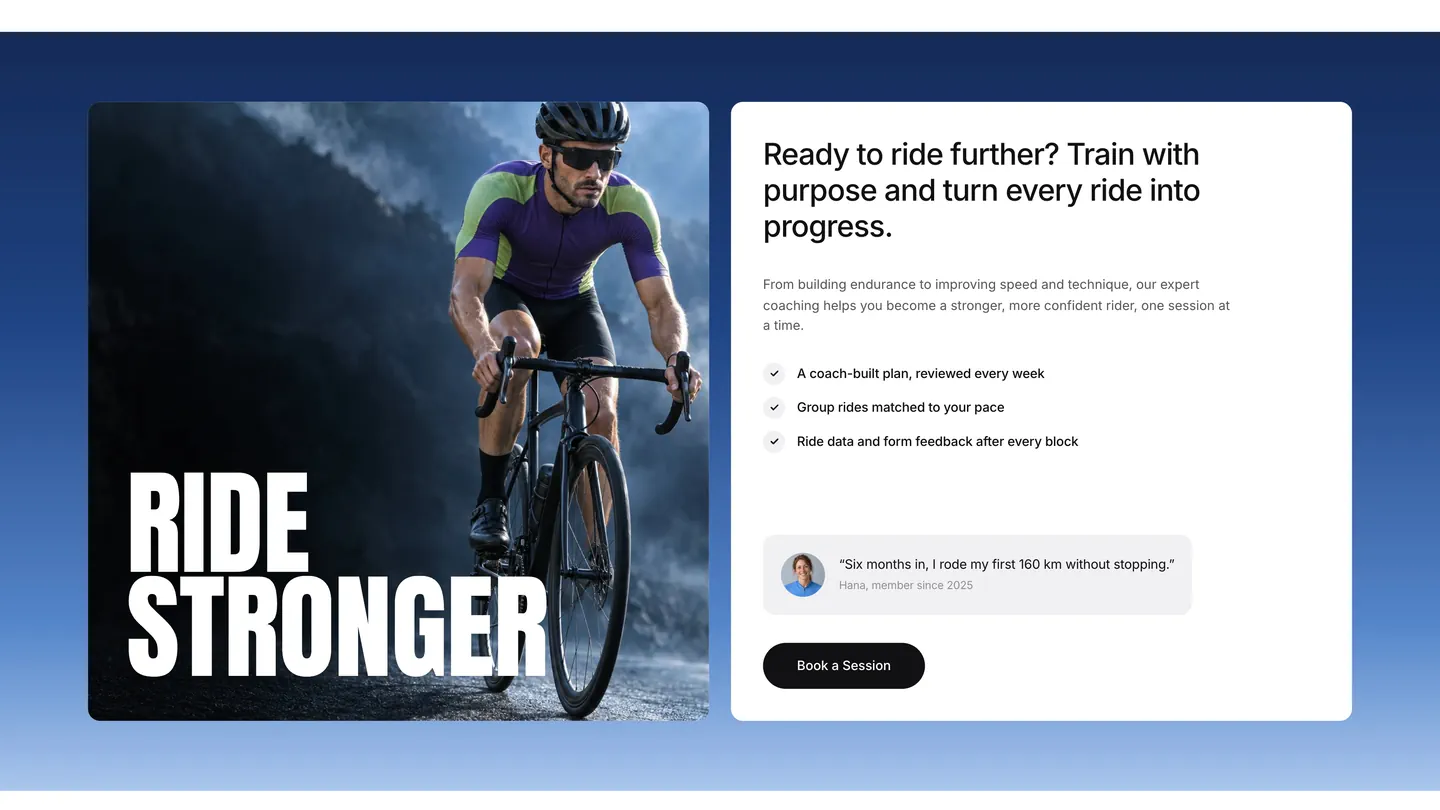
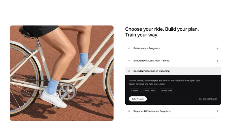
The concept had no live site to read, so every measure came from the screenshots: the tabbed hero card with its notched arrows, the session cards, the programme accordion and the blue booking band. The hero turns over three headlines, and a cut-out of each rider is placed from the photo’s own outline so the rider passes in front of the type.
Above 960 px the whole layout scales with the window, so it fills a 1920 screen as it does a laptop. Sections reveal on scroll to FF’s motion standard and settle at once when reduced motion is on.
- Client
- FF Dev Studio
- Type
- Cycling coaching landing page, recreation
- Role
- Frontend / Motion / Image direction
- Built with
- Vite, GSAP, Lenis
- Reference
- threads.com/@bee_ui.ux